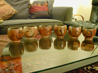
This is a set of six cups. They do not have handles, and so are intended for cold beverages such as juice or water. They are porcelain, and were fired to cone 10 in the wood kiln at Simon’s Rock. The dragons on them were made by inlaying black slip when the cups were leather hard, after trimming. The insides are glazed with Val Cushing’s amber celadon, and the outsides are not glazed. All six cups were placed in the middle stack in the kiln.
You can see that they are not all quite the same shape. This was my first attempt to make more than three items the same shape, and while these are close, in the future I think I will be able to be more precise with the form when I want a set. They are close enough to be a family, however, so in this case it is not a terrible mismatch.
The rims are all fairly identical, which is part of what makes the set a set, despite the individual differences in form. I was attempting to copy the rim of a cup that I particularly like. It is thin at the very edge, though not sharp, and just below the edge it is a little thicker. I think I succeeded, and I do like this style of rim. It has the advantages of a thin edge while being comfortable to use and pleasing to look at.
When I first trimmed these cups, I thought that the feet looked a lot like suction cups. I tried to smooth the edges so that they were a little rounder, leaving a bit of shadow between the foot and the table. I think that this helped some. I do like the angle of the feet compared to the sides of the cups, and the stability that is provided to the form by the side of the feet being flat rather than curved. The body of the cup is like a ball that has been set on the foot of the cup so that it will not roll off the table.
The outside surfaces of the cups are smooth, and the dragons are not raised or depressed into the surface. However, there were trimming marks left on the inside of the feet. These marks are attractive, but I am not sure that they are really consistent with the theme of smoothness set by the remainder of the outside of the cups.
On the insides of the cups, the throwing lines were left for contrast, although they are not particularly prominent lines. The liner glaze was a bit of an experiment. I was thinking that tenmokus look good in the wood kiln, and those glazes use iron as the colorant. I speculated that amber celadon, which also uses iron as the colorant, would also look good. The olive green that resulted reminds me of the olive green I have seen from tenmoku in a wood firing with a reduction cooling. It certainly doesn’t look like the dark honey color amber celadon usually is. I like the way the darkness inside the cup reflects the black dragon on the outside of the cup.
The cups were placed with the dragon side pointing away from the fire box so that the dragons would not be obscured by ash. On most of the cups, the side with the ash is arguably just as attractive as the side with the dragon.
In places where the ash did encounter the dragons directly, the line between the black slip and the clay is sharper, and the surface is shiny rather than matte. I like this shiny surface, and I think in the future I’d like to inlay patterns or images on all sides of pots and place them in different areas of the kiln to see what gets obscured and what becomes shiny and clear.
I call this dragon design abstract dragons. The essential parts are there – each dragon has a face, body, wings, whiskers, and horns (or ears; this is up for interpretation). These dragons are simple to draw or carve. The lines vary in width, which makes for a more interesting image than if the dragons were outlined rather than filled with color. I like the design, and I think I will continue to use it with other work.


No comments:
Post a Comment